The amount of time spent on content declines rapidly after two screenfuls of content
In comparison to a scrolling and attention study from 2010 a more recent study (2018) with eye-tracking, showed that user behaviour regarding vertical scrolling changed quite a bit and users learned scroll more vertically.
The reasons for this user change might be changes in general screen design, where longer pages are more prevalent nowadays, as the use of negative space has been widely adopted in web-design.
In our most recent study, users spent about 57% of their page-viewing time above the fold. 74% of the viewing time was spent in the first two screenfuls, up to 2160px. (Scrolling and Attention - nngroup)
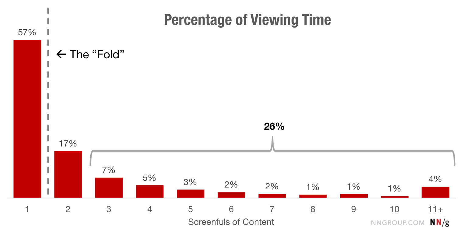
In 2010 80% of the viewing time on a page was spent above the fold, while nowadays roughly the same amount of time is being divided between the first two screenfuls.
This means, that content above the fold is still really important but users now scroll more quickly down the page, which makes the second screenful a very important area to optimize for, as it might influence the user to either continue reading or abandon the site entirely.
Differences between General Web & SERP
On general websites, more than 42% of the viewing time fell within the top 20% of the page, and more than 65% of the time was spent in the top 40% of the page. (Scrolling and Attention - nngroup)
On search-results pages (SERPs), which we did not isolate in the 2010 findings, 47% of the viewing time was spent on the top 20% of the page (and more than 75% in the top 40%) — likely a reflection of users’ tendency to look only at the top results. (Scrolling and Attention - nngroup)
Implications
- Reserve the top of the page for high-priority content: key business and user goals. The lower parts of the page can accommodate secondary or related information. Keep major CTAs above the fold.
- Use appropriate font styling to attract attention to important content: Users rely on elements like headers and bolded text to identify when information is important, and to locate new segments of content. Make sure that these elements are visually distinct and styled consistently across the site so users can easily find them.
- Beware of false floors, which are increasingly common with modern minimalist designs. The illusion of completeness can interfere with scrolling. Include signifiers (such as cut-off text) to tell people that there is content below the fold.
- Test your design with representative users to determine the “ideal” page length and make sure that the information that users want can be easily seen.